Download
Содержание:
Auto-layout columns
Utilize breakpoint-specific column classes for easy column sizing without an explicit numbered class like .
Equal-width
For example, here are two grid layouts that apply to every device and viewport, from to . Add any number of unit-less classes for each breakpoint you need and every column will be the same width.
1 of 2
2 of 2
1 of 3
2 of 3
3 of 3
Equal-width multi-line
Create equal-width columns that span multiple lines by inserting a where you want the columns to break to a new line. Make the breaks responsive by mixing with some responsive display utilities.
There was a that prevented this from working without an explicit or . There are workarounds for older browser versions, but they shouldn’t be necessary if your target browsers don’t fall into the buggy versions.
col
col
col
col
Setting one column width
Auto-layout for flexbox grid columns also means you can set the width of one column and have the sibling columns automatically resize around it. You may use predefined grid classes (as shown below), grid mixins, or inline widths. Note that the other columns will resize no matter the width of the center column.
1 of 3
2 of 3 (wider)
3 of 3
1 of 3
2 of 3 (wider)
3 of 3
Variable width content
Use classes to size columns based on the natural width of their content.
1 of 3
Variable width content
3 of 3
1 of 3
Variable width content
3 of 3
Horizontal
Add to change the layout of list group items from vertical to horizontal across all breakpoints. Alternatively, choose a responsive variant to make a list group horizontal starting at that breakpoint’s . Currently horizontal list groups cannot be combined with flush list groups.
ProTip: Want equal-width list group items when horizontal? Add to each list group item.
- Cras justo odio
- Dapibus ac facilisis in
- Morbi leo risus
- Cras justo odio
- Dapibus ac facilisis in
- Morbi leo risus
- Cras justo odio
- Dapibus ac facilisis in
- Morbi leo risus
- Cras justo odio
- Dapibus ac facilisis in
- Morbi leo risus
- Cras justo odio
- Dapibus ac facilisis in
- Morbi leo risus
Inline Custom Form Controls
If you want the custom form controls to sit side by side (inline), add the to the wrapper/container:
Custom radio
Custom radio
Example
<form> <div class=»custom-control custom-radio
custom-control-inline»>
<input type=»radio» class=»custom-control-input» id=»customRadio»
name=»example» value=»customEx»> <label
class=»custom-control-label» for=»customRadio»>Custom radio
1</label>
</div> <div class=»custom-control custom-radio
custom-control-inline»>
<input type=»radio» class=»custom-control-input» id=»customRadio2″
name=»example» value=»customEx»> <label
class=»custom-control-label» for=»customRadio2″>Custom radio
2</label>
</div> </form>
Examples
Due to the widespread use of tables across third-party widgets like calendars and date pickers, we’ve designed our tables to be opt-in. Just add the base class to any , then extend with custom styles or our various included modifier classes.
Using the most basic table markup, here’s how -based tables look in Bootstrap. All table styles are inherited in Bootstrap 4, meaning any nested tables will be styled in the same manner as the parent.
| # | First | Last | Handle |
|---|---|---|---|
| 1 | Mark | Otto | @mdo |
| 2 | Jacob | Thornton | @fat |
| 3 | Larry | the Bird |
You can also invert the colors—with light text on dark backgrounds—with .
| # | First | Last | Handle |
|---|---|---|---|
| 1 | Mark | Otto | @mdo |
| 2 | Jacob | Thornton | @fat |
| 3 | Larry | the Bird |
Validation and Errors
Rails normally wraps fields with validation errors in a , but this behaviour isn’t consistent with Bootstrap 4 styling. By default, generations in-line errors which appear below the field. But it can also generate errors on the label, or not display any errors, leaving it up to you.
Inline Errors
By default, fields that have validation errors will be outlined in red and the
error will be displayed below the field. Here’s an example:
<div class="form-group">
  <label class="form-control-label" for="user_email">Email</label>
  <input class="form-control is-invalid" id="user_email" name="user" type="email" value="">
  <small class="invalid-feedback">can't be blank</small>
</div>
You can turn off inline errors for the entire form like this:
<%= bootstrap_form_for(@user, inline_errors: false) do |f| %>
  ...
<% end %>
Label Errors
You can also display validation errors in the field’s label; just turn
on the option. Here’s an example:
<%= bootstrap_form_for(@user, label_errors: true) do |f| %>
  ...
<% end %>
By default, turning on will also turn off
. If you want both turned on, you can do that too:
<%= bootstrap_form_for(@user, label_errors: true, inline_errors: true) do |f| %>
  ...
<% end %>
Alert Messages
To display an error message with an error summary, you can use the
helper. This won’t output anything unless a model validation
has failed.
<%= f.alert_message "Please fix the errors below." %>
Which outputs:
<div class="alert alert-danger">
  <p>Please fix the errors below.</p>
  <ul class="rails-bootstrap-forms-error-summary">
    <li>Email can't be blank</li>
  </ul>
</div>
You can turn off the error summary like this:
<%= f.alert_message "Please fix the errors below.", error_summary: false %>
To output a simple unordered list of errors, use the helper.
<%= f.error_summary %>
Which outputs:
<ul class="rails-bootstrap-forms-error-summary">
  <li>Email can't be blank</li>
</ul>
Errors On
If you want to display a custom inline error for a specific attribute not
represented by a form field, use the helper.
<%= f.errors_on :tasks %>
Which outputs:
<div class="alert alert-danger">Tasks can't be blank.</div>
You can hide the attribute name like this:
<%= f.errors_on :tasks, hide_attribute_name: true %>
Which outputs:
<div class="alert alert-danger">can't be blank.</div>
How it works
Bootstrap’s grid system uses a series of containers, rows, and columns to layout and align content. It’s built with flexbox and is fully responsive. Below is an example and an in-depth look at how the grid comes together.
New to or unfamiliar with flexbox? for background, terminology, guidelines, and code snippets.
One of three columns
One of three columns
One of three columns
The above example creates three equal-width columns on small, medium, large, and extra large devices using our predefined grid classes. Those columns are centered in the page with the parent .
Breaking it down, here’s how it works:
- Containers provide a means to center and horizontally pad your site’s contents. Use for a responsive pixel width or for across all viewport and device sizes.
- Rows are wrappers for columns. Each column has horizontal (called a gutter) for controlling the space between them. This is then counteracted on the rows with negative margins. This way, all the content in your columns is visually aligned down the left side.
- In a grid layout, content must be placed within columns and only columns may be immediate children of rows.
- Thanks to flexbox, grid columns without a specified will automatically layout as equal width columns. For example, four instances of will each automatically be 25% wide from the small breakpoint and up. See the section for more examples.
- Column classes indicate the number of columns you’d like to use out of the possible 12 per row. So, if you want three equal-width columns across, you can use .
- Column s are set in percentages, so they’re always fluid and sized relative to their parent element.
- Columns have horizontal to create the gutters between individual columns, however, you can remove the from rows and from columns with on the .
- To make the grid responsive, there are five grid breakpoints, one for each : all breakpoints (extra small), small, medium, large, and extra large.
- Grid breakpoints are based on minimum width media queries, meaning they apply to that one breakpoint and all those above it (e.g., applies to small, medium, large, and extra large devices, but not the first breakpoint).
- You can use predefined grid classes (like ) or for more semantic markup.
Be aware of the limitations and bugs around flexbox, like the .
Обходными путями
В некоторых случаях геймерам всё же необходимо поменять логин, а не ник. Такой вариант допустим. Только надобно действовать обходным путём. Перед тем, как сменить имя пользователя в Steam, требуется создать новый профиль и прикрепить все данные к старому имени для входа.
Итак, игрок должен создать новую учётную запись. Для этого нужно выйти из своей нынешней записи. На верхней панели находится вкладка Steam. При нажатии на неё, откроется список команд. Выберите команду «Сменить пользователя…». 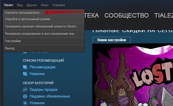
После этого откроется окно для входа в программу . Дальше пользователь должен создать новую учётную запись и зарегистрировать её в Стиме. Для регистрации выполняются нижеуказанные шаги:
- В окне «Вход в Steam» выбираем строку «Создать новый аккаунт…».
- В следующем окне будет размещаться информация о правилах пользования программой. Здесь подтверждаем согласие и переходим дальше.
- Появляется окошко «Создание аккаунта Steam», в котором пишем новое имя и пароль. Имя должно быть уникальным и не иметь аналогов. Можно выбрать один из тех похожих на ваш, который предложит сервис. Если придуманного логина нет в системе, жмёте «Далее».
- Вводим адрес электронной почты два раза и снова нажимаем «Далее»
- В новой форме размещены сведения о новой учётной записи. Её можно распечатать, нажав на иконку принтера.
- После нажатия «Далее» возникнет новое сообщение о том, что всё готово. Нажимаем на клавишу «Готово» и входим в новый профиль.
- После входа в новый аккаунт появляется зелёный баннер с вопросом о прописанном адресе электронной почты. Если он записан правильно, то нажимаем на баннере «Да».
- Переходим к форме подтверждения электронного адреса и читаем способ подтверждения.
- Письмо будет отправлено на указанный почтовый ящик. Жмём на пункт «Готово» и заходим к себе на e-mail, ищем письмо и нажимаем на ссылку в нём «Подтвердить адрес эл. почты». На этом шаге регистрация нового аккаунта завершена.
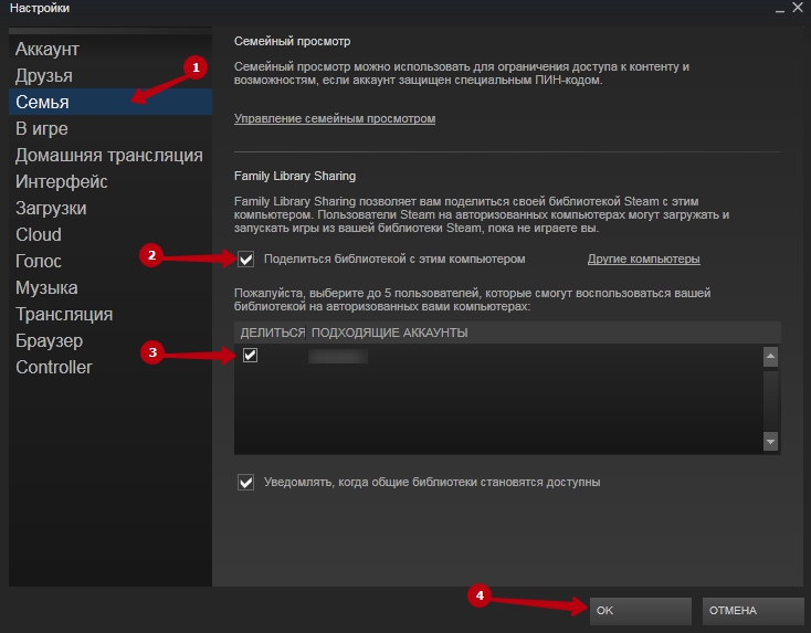
Вслед за тем, как геймер создал новую учётную запись и подтвердил почту, он может заметить, что его запись абсолютно пустая. Необходимо перенести библиотеку игрушек со старого аккаунта. С этой целью надо зайти на вкладку Стим сверху профиля и избрать строку Настройки.
СОВЕТ.
Затем, чтоб подключить библиотеку бывшего профиля, нужно открыть семейный доступ. С его помощью другой игрок может тоже подключиться к вашей учётной записи и играть в игры, так, как если бы это были вы.
В окне настроек выбираем строку Семья . Справа открывается меню семейного доступа. Во вкладке Family Library Sharing нажимаем клавишу «Авторизовать этот компьютер». Старый логин добавится в новую учетную запись. Мы получаем две ваших страницы, которые имеют доступ к игрушкам друг друга. После этого меняем информацию на новом профиле. Кликаем по никнейму, выбираем «Профиль» и «Редактировать профиль». Дальше вводим старую информацию, которая была под другим логином.
По завершении всего процесса добавляем друзей из бывшего аккаунта, прислав всем сообщения на добавления в друзья. Чтобы найти старое имя, вводим его в поиск пользователей Стим.
Бытие игровой платформы Steam берёт своё начало на заре появления и развития интернета — в 1999 году. Когда геймеры целыми днями воевали в Counter-Strike и Team Fortess Classic. Когда пребывание в игре 3-4 тыс. человек онлайн означало её колоссальную популярность.
Прозорливые игроделы из Valve осознали, что у сетевого гейминга огромное будущее. И засучив рукава, рьяно принялись за работу. Первая версия Steam была явлена игровому сообществу в 2002 году. Раньше реализовать намеченные планы разработчикам не удалось из-за флегматичности компаньонов: они выказывали участие в проекте только на словах.
Первой волной популярности Стим обязан игре Half-Life 2. Valve сделали правильную ставку. Ну кто же пройдёт мимо второй части легендарного шутера. Устанавливали игру, устанавливали и клиент платформы. Чуть позже некоторые издатели, смекнув перспективу предприятия, начали обращаться с просьбами в компанию о том, чтобы «приютить» их игровые проекты (дистрибутивы и дополнительные моды).
Из этой статьи вы узнаете, как пользоваться аккаунтом Стим: как выполнить авторизацию и выйти на офсайте и в клиенте, как установить адрес другой почты в профиле, как зарегистрировать игру и пр.
Пользовательские компоненты

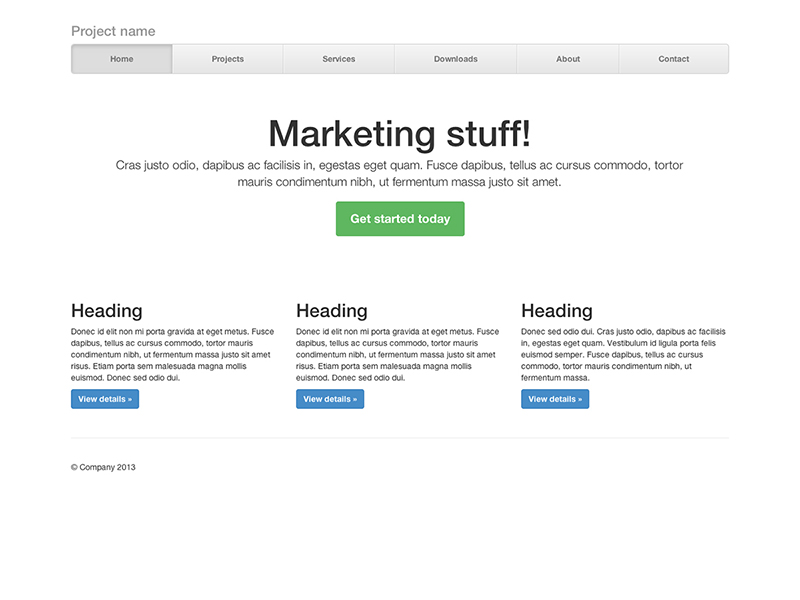
Одностраничный шаблон для построения простых и красивых домашних страниц.
Сочетание в шаблоне нав. меню и карусели, с добавлением некоторых новых компонентов.
Простой блог в две колонки с пользовательской навигацией, заголовком, и видом.
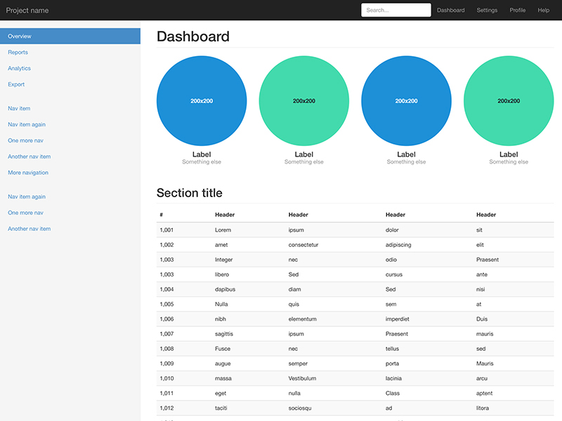
Базовая структура для администратора приборная панель с фиксированным боковым меню и панели навигации.
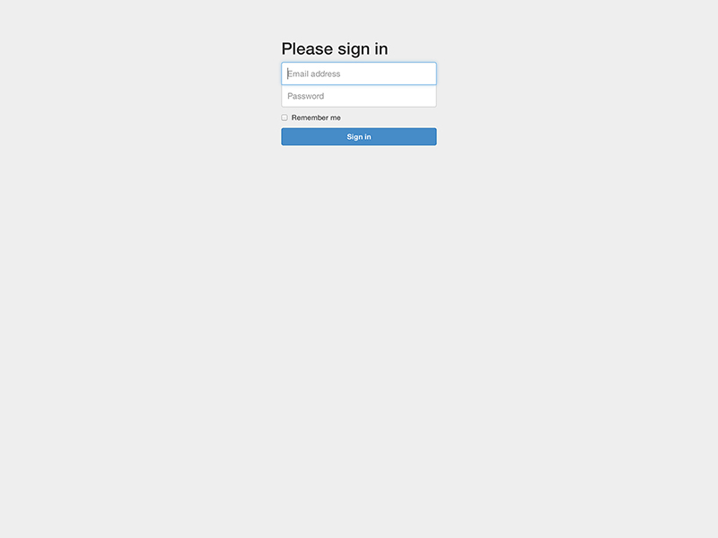
Шаблон пользовательской формы настроен для простого входа на сайт.
Создание компонованого нав. меню с выровненными ссылками
Внимание!
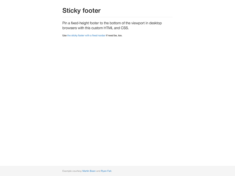
Закрепление колонтитула в нижней части браузера для случая, когда высота контента сама собой не делает этого.
Bootstrap Form Control States
- INPUT FOCUS — The outline of the input is removed and a box-shadow is applied on focus
- DISABLED INPUTS — Add a attribute to disable an input field
- DISABLED FIELDSETS — Add a attribute to a fieldset to disable all controls within
- READONLY INPUTS — Add a attribute to an input to prevent user input
-
VALIDATION STATES — Bootstrap includes validation styles for error, warning, and
success messages. To use, add , , or to the parent element - ICONS — You can add feedback icons with the class and an icon
- HIDDEN LABELS — Add a class on non-visible labels
The following example demonstrates some of the form control states above in a Horizontal form:
Example
<form class=»form-horizontal»> <div class=»form-group»> <label class=»col-sm-2 control-label»>Focused</label> <div class=»col-sm-10″> <input class=»form-control» id=»focusedInput» type=»text» value=»Click to focus»> </div> </div> <div class=»form-group»> <label for=»disabledInput» class=»col-sm-2 control-label»>Disabled</label> <div class=»col-sm-10″> <input class=»form-control» id=»disabledInput» type=»text» disabled> </div> </div> <fieldset disabled> <div class=»form-group»> <label for=»disabledTextInput» class=»col-sm-2 control-label»>Fieldset disabled</label> <div class=»col-sm-10″> <input type=»text» id=»disabledTextInput» class=»form-control»> </div> </div> <div class=»form-group»> <label for=»disabledSelect» class=»col-sm-2 control-label»></label> <div class=»col-sm-10″> <select id=»disabledSelect» class=»form-control»> <option>Disabled select</option> </select> </div> </div> </fieldset> <div class=»form-group has-success has-feedback»> <label class=»col-sm-2 control-label» for=»inputSuccess»> Input with success and icon</label> <div class=»col-sm-10″> <input type=»text» class=»form-control» id=»inputSuccess»> <span class=»glyphicon glyphicon-ok form-control-feedback»></span> </div> </div> <div class=»form-group has-warning has-feedback»> <label class=»col-sm-2 control-label» for=»inputWarning»> Input with warning and icon</label> <div class=»col-sm-10″> <input type=»text» class=»form-control» id=»inputWarning»> <span class=»glyphicon glyphicon-warning-sign form-control-feedback»></span> </div> </div> <div class=»form-group has-error has-feedback»> <label class=»col-sm-2 control-label» for=»inputError»> Input with error and icon</label> <div class=»col-sm-10″> <input type=»text» class=»form-control» id=»inputError»> <span class=»glyphicon glyphicon-remove form-control-feedback»></span> </div> </div></form>
And here is an example of some of the form control states in an Inline form:
Example
<form class=»form-inline»> <div class=»form-group»> <label for=»focusedInput»>Focused</label> <input class=»form-control» id=»focusedInput» type=»text»> </div> <div class=»form-group»> <label for=»inputPassword»>Disabled</label> <input class=»form-control» id=»disabledInput» type=»text» disabled> </div> <div class=»form-group has-success has-feedback»> <label for=»inputSuccess2″>Input with success</label> <input type=»text» class=»form-control» id=»inputSuccess2″> <span class=»glyphicon glyphicon-ok form-control-feedback»></span> </div> <div class=»form-group has-warning has-feedback»> <label for=»inputWarning2″>Input with warning</label> <input type=»text» class=»form-control» id=»inputWarning2″> <span class=»glyphicon glyphicon-warning-sign form-control-feedback»></span> </div> <div class=»form-group has-error has-feedback»> <label for=»inputError2″>Input with error</label> <input type=»text» class=»form-control» id=»inputError2″> <span class=»glyphicon glyphicon-remove form-control-feedback»></span> </div></form>
❮ Previous
Next ❯
Submit Buttons
The CSS classes are automatically added to your submit
buttons.
<%= f.submit %>
You can also use the helper, which adds to your
submit button:
<%= f.primary "Optional Label" %>
You can specify your own classes like this:
<%= f.submit "Log In", class: "btn btn-success" %>
If the helper receives a option or a block,
it will be rendered as an HTML button, instead of an input tag. This allows you
to specify HTML content and styling for your buttons (such as adding
illustrative icons to them). For example, the following statements
<%= f.primary "Save changes <span class='fa fa-save'></span>".html_safe, render_as_button: true %>

<%= f.primary do
      concat 'Save changes '
      concat content_tag(:span, nil, class: 'fa fa-save')
    end %>
are equivalent, and each of them both be rendered as:
<button name="button" type="submit" class="btn btn-primary">Save changes <span class="fa fa-save"></span></button>
If you wish to add additional CSS classes to your button, while keeping the
default ones, you can use the option. This is particularly useful
for adding extra details to buttons (without forcing you to repeat the
Bootstrap classes), or for element targeting via CSS classes.
Be aware, however, that using the option will discard any extra classes
you add. As an example, the following button declarations
<%= f.primary "My Nice Button", extra_class: 'my-button' %>

<%= f.primary "My Button", class: 'my-button' %>
will be rendered as
<input type="submit" value="My Nice Button" class="btn btn-primary my-button" />

<input type="submit" value="My Button" class="my-button" />
(some unimportant HTML attributes have been removed for simplicity)
Функционал разметки
При Bootstrap использует s или s для определения большинства размеров, s применяются для грид точки останова и ширины контейнера. Это происходит потому, что Ширина области просмотра в пикселях и не меняется с .
Смотри как аспекты Bootstrap блочная система работают на нескольких устройствах с таблица.
| Сверхмалые<544px | Небольшой≥544px | Средний≥768px по | Большие≥992px | Очень большой≥1200px | |
|---|---|---|---|---|---|
| Поведение разметки | Horizontal at all times | Collapsed to start, horizontal above breakpoints | |||
| Ширина контейнера | None (auto) | 576px | 720px | 940px | 1140px |
| Класс префикса | |||||
| # колонок | 12 | ||||
| Промежуточная ширина | 1.875rem / 30px (15px on each side of a column) | ||||
| Вкладка | Yes | ||||
| Отступ | Yes | ||||
| Выравнивание столбцов | Yes |
Sass mixins
When using Bootstrap’s source Sass files, you have the option of using Sass variables and mixins to create custom, semantic, and responsive page layouts. Our predefined grid classes use these same variables and mixins to provide a whole suite of ready-to-use classes for fast responsive layouts.
Variables
Variables and maps determine the number of columns, the gutter width, and the media query point at which to begin floating columns. We use these to generate the predefined grid classes documented above, as well as for the custom mixins listed below.
Example usage
You can modify the variables to your own custom values, or just use the mixins with their default values. Here’s an example of using the default settings to create a two-column layout with a gap between.
Main content
Secondary content
Скрытые метки
В полях ввода всегда должны указываться метки, иначе программы чтения с экрана ожидают проблемы. При необходимости вы можете скрыть метку с помощью класса .sr-only.
Здесь мы используем .sr-only, чтобы скрыть метки, а также добавляем атрибут placeholder, чтобы подсказывать пользователю что вводить. Использование атрибута placeholder таким способом не рекомендуется, так как это может вызвать проблемы с удобством пользования.
<link rel=»stylesheet» href=»https://maxcdn.bootstrapcdn.com/bootstrap/4.0.0/css/bootstrap.min.css»>
<form class=»form-inline»>
<label class=»mr-sm-2 mb-0 sr-only» for=»first_name»>Имя</label>
<input type=»text» class=»form-control mr-sm-2 mb-2 mb-sm-0″
id=»first_name» name=»first_name» placeholder=»Имя»>
<label class=»mr-sm-2 mb-0 sr-only» for=»last_name»>Фамилия</label>
<input type=»text» class=»form-control mr-sm-2 mb-2 mb-sm-0″
id=»last_name» name=»last_name» placeholder=»Фамилия»>
<button type=»submit» class=»btn btn-primary mt-2 mt-sm-0″>Отправить</button>
</form>
Form Validation
You can use different validation classes to provide valuable feedback to
users. Add either or to the element,
depending on whether you want to provide validation feedback before or after
submitting the form. The input fields will have a green (valid) or red (invalid)
border to indicate what’s missing in the form. You can also add a
or message to tell the user explicitly what’s
missing, or needs to be done before submitting the form.
Example
In this example, we use to indicate what’s missing before submitting the form:
<form action=»/action_page.php» class=»was-validated»>
<div class=»form-group»> <label
for=»uname»>Username:</label> <input type=»text»
class=»form-control» id=»uname» placeholder=»Enter username» name=»uname»
required> <div class=»valid-feedback»>Valid.</div>
<div class=»invalid-feedback»>Please fill out this field.</div>
</div> <div class=»form-group»> <label
for=»pwd»>Password:</label> <input type=»password»
class=»form-control» id=»pwd» placeholder=»Enter password» name=»pswd»
required> <div class=»valid-feedback»>Valid.</div>
<div class=»invalid-feedback»>Please fill out this field.</div>
</div> <div class=»form-group form-check»>
<label class=»form-check-label»> <input
class=»form-check-input» type=»checkbox» name=»remember» required> I agree on
blabla. <div
class=»valid-feedback»>Valid.</div> <div
class=»invalid-feedback»>Check this checkbox to continue.</div>
</label> </div> <button type=»submit» class=»btn
btn-primary»>Submit</button></form>
Example
In this example, we use , which will add the validation effect AFTER the form has been submitting (if there’s anything missing).
Note that you will also have to add some jQuery code for this example to work
properly:
<form action=»/action_page.php» class=»needs-validation»
novalidate>
<div class=»form-group»> <label
for=»uname»>Username:</label> <input type=»text»
class=»form-control» id=»uname» placeholder=»Enter username» name=»uname»
required> <div class=»valid-feedback»>Valid.</div>
<div class=»invalid-feedback»>Please fill out this field.</div>
</div> <div class=»form-group»> <label
for=»pwd»>Password:</label> <input type=»password»
class=»form-control» id=»pwd» placeholder=»Enter password» name=»pswd»
required> <div class=»valid-feedback»>Valid.</div>
<div class=»invalid-feedback»>Please fill out this field.</div>
</div> <div class=»form-group form-check»>
<label class=»form-check-label»> <input
class=»form-check-input» type=»checkbox» name=»remember» required> I agree on
blabla. <div
class=»valid-feedback»>Valid.</div> <div
class=»invalid-feedback»>Check this checkbox to continue.</div>
</label> </div> <button type=»submit» class=»btn
btn-primary»>Submit</button></form><script>//
Disable form submissions if there are invalid fields(function() { ‘use strict’;
window.addEventListener(‘load’, function() { // Get the
forms we want to add validation styles to var forms =
document.getElementsByClassName(‘needs-validation’); //
Loop over them and prevent submission var validation =
Array.prototype.filter.call(forms, function(form) {
form.addEventListener(‘submit’, function(event) {
if (form.checkValidity() === false) {
event.preventDefault();
event.stopPropagation(); }
form.classList.add(‘was-validated’); },
false); }); }, false);})();</script>
❮ Previous
Next ❯
Contextual classes
Use contextual classes to style list items with a stateful background and color.
- Dapibus ac facilisis in
- A simple primary list group item
- A simple secondary list group item
- A simple success list group item
- A simple danger list group item
- A simple warning list group item
- A simple info list group item
- A simple light list group item
- A simple dark list group item
Contextual classes also work with . Note the addition of the hover styles here not present in the previous example. Also supported is the state; apply it to indicate an active selection on a contextual list group item.
Conveying meaning to assistive technologies
Using color to add meaning only provides a visual indication, which will not be conveyed to users of assistive technologies – such as screen readers. Ensure that information denoted by the color is either obvious from the content itself (e.g. the visible text), or is included through alternative means, such as additional text hidden with the class.


